FIRST COMMUNITY BANK - PERRYVILLE
Project:
To remodel the current First State Community Bank in Perryville, MO. Worked alongside branch president, Dennis Bohnert, branch manager, Denise Steffens and subs as the interior designer and project manager. A complete plan of action was laid out and executed in the shortest amount of time possible. Subs were to do the work in the evenings and on the weekends so that employees wouldn’t be bothered.
Inspiration:
The branding of FSCB, which consists of a penny and bone color combination. The new walls that were built were mimicked from the existing ramp wall on the outer perimeter of the main level. Perryville is a very small town, just like the rest of their branches and Dennis wanted to be modest with the look of the bank so it didn’t scare new/existing customers away.
The Client:
FSCB was established in Farmington in 1954. The Perryville branch opened its doors in the 80’s and has since been a time capsule due to its minimal spending. FSCB continues to acquire banks due to their continued success and is now the largest banking organization headquartered in Southeast Missouri. Dennis gave me the freedom to suggest cost conscious designs, concepts and finishes that I thought would appeal to Perryville’s clientele that made sense. I brought new ideas to the table and reassured them that with their budget they could postpone some of the less important things.
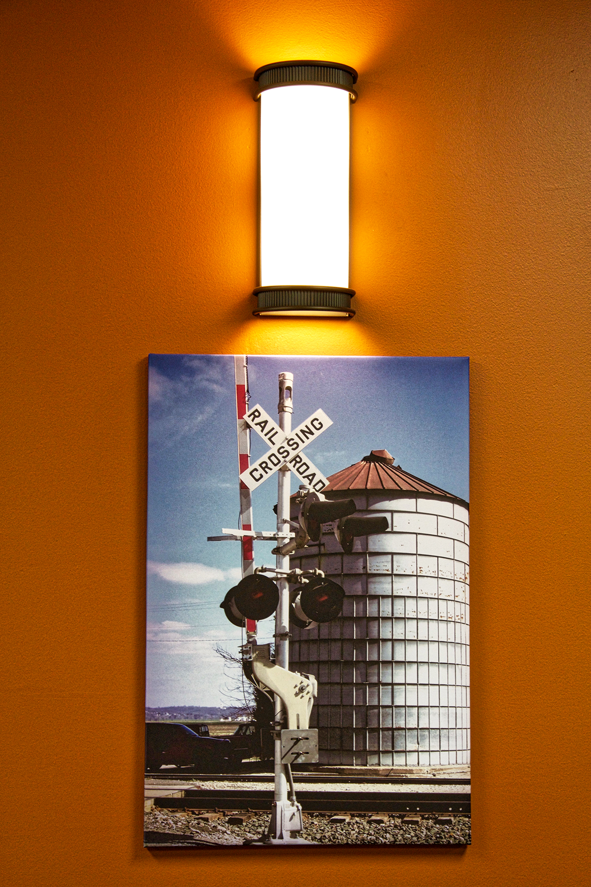
What We Love:
• The new walls that were built, instead of recovering or reordering new cubicles, were framed, sheet rocked, painted and finished with a natural oak 1x6 to mimic the half wall/handrail going up the ramp around the perimeter of the main lobby.
• The Sherwin Williams #6108 Latte Walls. For years, every time I would step foot in the bank I would cringe, because there was a pink and green floral painted stencil boarder near the ceiling of the entire main lobby. Thank you Rick Taylor for priming and painting all of the walls and for covering up the dearly departed stencil boarder. It will not be missed!
• The flooring. The time spent selecting the perfect, tile for the lobby, carpet tile for the offices, broadloom with an extra padded backing for the tellers and the walk-off carpet with the custom logo insert, truly paid off and the transitions were minimal. The tile and carpet should be timeless and will mask any dirt that the heavy duty walk-off carpet doesn’t catch.
What We Did:
I met with Dennis and Denise to discuss what they wanted to achieve, the bids they already obtained and who they wanted to do the work. After discussing their plan to reupholster/order new cubicles, I couldn’t help but to think the only way to make cubicles look right in the space was to actually build the walls that were needed and possibly save them some money. Early on in the project three color palettes with all of their choices were presented, their decisions/our collaboration, can be seen in the following pictures. Tile for the lobby (ISC Gallery- Essence- Carmel), carpet tile (Shaw- Shadow- Profile and Sketch- Kindle) for the offices, broadloom (Mannington- Tx Style- Bark II- Barcelona) with an extra padded backing for the tellers and the walk-off carpet (Shaw- Steppin Out- Welcome II- Walnut and Portabella) with the custom logo insert for the vestibule, paint colors (SW Latte and SW Brandywine), sconces to replace the existing fixtures, teller laminates (Wilsonart- Colombian Walnut and Mountain Passage) and the design for the free-standing deposit slip/computer banking station, custom vertical blinds (Hunter Douglas- Somner- Brighton Bay) and custom faux wood blinds (Pinnicle- Faux Wood- Golden Oak) were ordered to replace the aged ones in the offices on the second floor, aged maroon mini blinds were replaced with etched vinyl in the entrance, new executive, task and guest chairs were ordered, pictures that were taken by the employees were uploaded to a company to have the images printed on canvas, stretched onto frames and were installed.